|
|
A dot plot is a type of graphic display using filled in circles (dots) and a simple scale to compare the counts (frequency) within categories or groups, when working with small data sets with a small number of groups. |
|
 Dot Plot Information: Dot Plot Information:
• Used with relatively small sets of data and groups.
• Quickly displays clusters/gaps of data and outliers.
• Each dot represents one observation.
(unless otherwise indicated)
• Dots are usually stacked in a column.
(not as popular is a vertical scale with horizontal dots)
• Column heights represent count (frequency).
• May have categories or numbers on the x-axis.
|
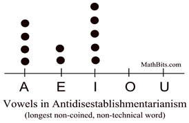
If the x-axis contains letters or words (non-numerical categories), the graph is said to be a qualitative dot plot. The dot plot shown above, is a qualitative dot plot, since A, E, I, O and U are not numerical values. Qualitative (categorical) variables cannot be described in terms of center, spread, or shape.
If the x-axis contains numbers (numerical categories), the graph is said to be a quantitative dot plot. This dot plot can be described in terms of center, spread or shape.
The dot plot shows basic facts about the distribution of the data. In the example above, we can quickly see which vowel appeared the greatest number of times, as well as vowels that did not appear at all. In addition, dot plots shows the frequency of specific data entries.
Dot plots can be prepared with the scale running from left to right (as show above), or with the scale running up and down and dots lined-up horizontally.


Students in Mr. Smith's class were surveyed as to the number of brothers and sisters in their families (not counting themselves). The results are displayed in the table below.
a. Prepare a dot plot. Discuss the center, spread and shape, if appropriate.
b. Answer the questions relating to the dot plot.
Student |
Number of Brothers/Sisters |
Allison |
2 |
Bernard |
4 |
Carlos |
3 |
Catherine |
2 |
Delia |
2 |
Dion |
1 |
Emma |
0 |
Fiona |
2 |
Harley |
3 |
Ian |
2 |
Justin |
1 |
Paul |
1 |
Rhianna |
3 |
Stanley |
0 |
Vincent |
4 |
|
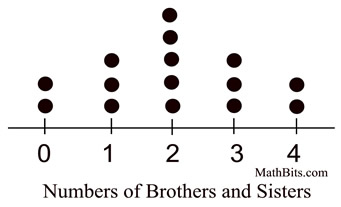
a. Once the data is placed in the dot plot, the characteristics of the data are immediately noticeable. Because the categories/groups are numbers (quantitative), it is appropriate to discuss the center, spread and shape.
Center: The center of the data is at 2 siblings. Both the mean and the median are 2.
Spread: The range of the number of siblings is from 0 to 4. There are no outliers.
Shape: The shape of the graph is symmetric.
|
b. Questions relating to the dot plot:
•
Which is the most common number of brothers and sisters in this class? 2
(The largest number of dots appears above 2.)
• How many students have a total of 3 brothers and sisters? 3
(There are 3 dots above 3.)
• How many students, in total, were surveyed? 15 students
(There are 15 total dots.)
• How many students have more than two brothers and sisters? 5
(Counting the dots above 3 and 4, shows a total of 5.)
Since the shape of this graph is symmetric (normal) and the mean and the median are the same, the mean is the most appropriate measure of center for this data set.
|
 Dot plots:
Pros and Cons |
Dot plots can be quickly prepared for small amounts of data. They have no need for a frequency axis, and they offer a visual means of comparison.
In dot plots, however, you need to count to find the total number of data elements in each stack of dots, and they can be difficult to construct and interpret for data sets with lots of points. |
|
NOTE: The re-posting of materials (in part or whole) from this site to the Internet
is copyright violation
and is not considered "fair use" for educators. Please read the "Terms of Use". |
|