|
Often times, we need to know more about our data than just a possible "center" value.
One of the additional pieces of information that we may need is the actual distribution of the data (how the data is spread out). To find this information, we examine the data for a
five statistical summary (or five number summary): (1) minimum, (2) maximum, (3) median (second quartile), (4) first quartile, and (5) third quartile. These pieces of information will show the extent to which the data is located near the center or near the extremes of the data set.

 Five Statistical Summary Five Statistical Summary |
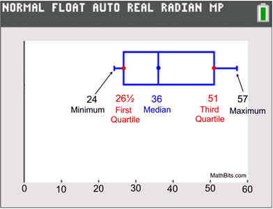
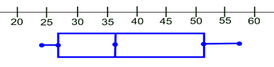
Let's describe a data set (shown below) with a five statistical summary:
minimum, maximum, median, first quartile and third quartile.
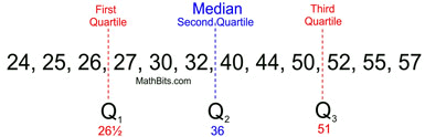
DATA SET: {24, 25, 26, 27, 30, 32, 40, 44, 50, 52, 55, 57}
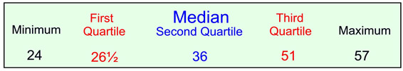
While not telling every value in the data set, a five statistical summary will tell you that:
|
|
For calculator help with
five-number summary
click here. |
|
|
| |
• half (50%) of the data values are below 36,
• half (50%) of the data values are above 36, and
• half (50%) of the scores are between 26½ and 51 |
| It also tells how the data break out in quarters,
along with the smallest and largest data values. |
Box and Whisker Plots display a five statistical summary.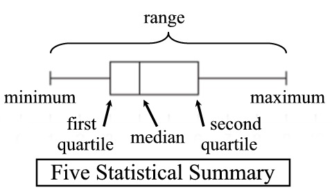
Box & Whiskers Plots |
A five statistical summary can be represented graphically as a box and whisker plot (or box plot). The first and third quartiles are the ends of the box, the median is indicated with a vertical line in the interior of the box, and the minimum and maximum are the ends of the whiskers (unless an outlier is present). Each of the four "sections" of a box plot represents 25% of the data in the set. |
 |
How to construct a box and whisker plot by hand:
|
Write the data in ascending numerical order. Find the minimum, first quartile, median, third quartile and maximum (the five statistical summary).
minimum = 24
first quartile = 26½
median = 36
third quartile = 51
maximum = 57 |
 |
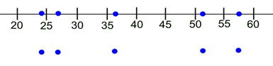
Prepare an equally spaced number line that will contain your values. Place a large dot beneath each of the five statistical summary values on the number line. You may place the dots ON the line or BELOW the line. |
 |
Draw a box with the ends through the points for the first and third quartiles. Draw a vertical line through the box at the median. Draw the whiskers from each end of the box to the minimum and maximum values (unless you have an outlier). |
 |
Note: While box and whisker plots are generally drawn horizontally (as shown above),
it is also acceptable to draw box and whisker plots vertically. |
So what do you do if you have an outlier?
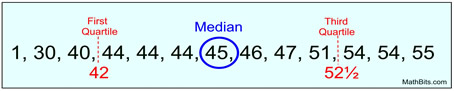
Data Set: {1, 30, 40, 44, 44, 44, 45, 46, 47, 51, 54, 54, 55}
It certainly looks like the "1" is not in keeping with the rest of these values. Let's test it to see if it is an outlier. First, we need to find the first and third quartiles:
|
|
Now, do the calculations to test for an outlier:
Is "1" less than Q1 - (1.5 • IQR)?
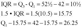
Since "1" is less than 26.25,
"1" is definitely an outlier.
The "1" is plotted as a single dot (or asterisk *), separate from the box's whisker . The whisker then uses 30 as its minimum point.
|
 Graph with outlier.
 |
If this outlier is used as the end point of the left whisker, readers may think that there are grades dispersed evenly throughout the whole range from 1 to 42, which is not the case. The use of the separately plotted outlier gives us more reliable information about this data set. |
|
Did you notice that the IQR is actually the horizontal length of the box in a box and whisker plot? Thus, an outlier is any value that lies more than one and one-half times the length of the box from either end of the box.
|
|
|
|
For calculator help with
box and whisker plots
click here. |
|
|
 Box plots:
Pros and Cons |
Box plots are useful for quickly indicating whether the distributions are skewed, and whether there are any outliers in the data set. Box plots are also useful when representing large amounts of data, and when comparing data sets.
While a box and whisker plot displays several important features of a distribution, it does not show the distribution of the data in as much detail as a histogram or dot plot. |
|
Box plots show the shape of the distribution of the data, the central value, and the variability.
It uses the median as its center value and presents a brief picture of the distribution of the other values in the form of its five statistical summary.
| Shapes of Plots |
|
|
 |
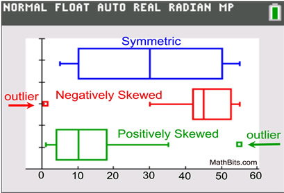 |
Symmetric: If a box and whisker plot is symmetric, the median is equidistant from the minimum and the maximum.
Negatively Skewed: If a box and whisker plot is negatively skewed, the distance from the median to the minimum is greater than the distance from the median to the maximum.
Positively Skewed: If a box and whisker plot is positively skewed, the distance from the median to the maximum is greater than the distance from the median to the minimum.
|
|
For calculator help with
box and whisker plots
click here. |
|
|
|
For calculator help with
five-number summary
click here. |
|
|
NOTE: The re-posting of materials (in part or whole) from this site to the Internet
is copyright violation
and is not considered "fair use" for educators. Please read the "Terms of Use". |
|