 |
A scatter plot is a graph of plotted points that shows a relationship between two sets of quantitative data (referred to as bivariate data). |
|
 Scatter plots are composed of "dots" (points) on a set of coordinate axes. Scatter plots are composed of "dots" (points) on a set of coordinate axes.
Do NOT connect the dots!
(See link at the bottom of this page for using the calculator to graph scatter plots.)
Statisticians and quality control technicians spend a good deal of time
gathering sets of data to determine if relationships exist between the sets.
Scatter plots are a popular and effective way of graphing data to display patterns, trends, relationships and an occasional extraordinary value located apart from the other values.

Let's see an example.
Does studying for that Final Exam really help your score?
Does
one event really affect the other? |
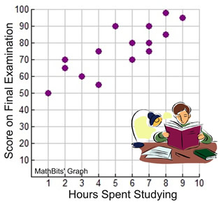
The scatter plot at the right appears to show that the longer students studied, the higher their examination scores.
According to this survey of 15 students studying for the same examination, it appears that the answer to our initial question is "yes", studying does affect your score. At least, the answer is "yes", for this particular group of students.
|
|
NOTE: A scatter plot is not necessarily a "function". It is often the case where the same x-value may have more than one corresponding y-value, such as (6,70) and (6,80).
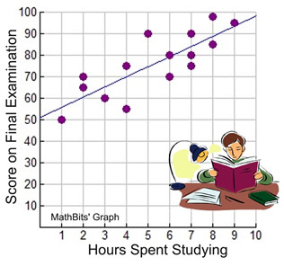
Notice how the data in the graph could resemble a straight line rising from left to right. When working with scatter plots, if is often useful to represent the data with the equation of a straight line, called a "line of best fit", or a "trend" line. Such a line may pass through some of the points, none of the points, or all of the points on the scatter plot.
To see how to prepare a line of best fit "by hand"
and a line of best fit "with a graphing calculator", click the link below.

What is the line of best fit for our
"studying affects scoring" problem? |
When finding the line of best fit "by hand", different students may arrive at different answers. So who's answer is the best? You will need some form of technology, such as a graphing calculator, to get the "best" answer.
The graphing calculator computed the line of best fit for our data as shown at the right. The equation is:
y = 4.722392638x + 50.99539877 |
|
Based upon this equation, we can predict scores given any number of hours spent studying. |

The line of best fit created by the calculator is called a linear regression.
 |
A linear regression models the relationship between two variables by fitting the best possible linear equation to the observed data.
|
|
A linear regression line has an equation of the form y = ax + b,
where a is the slope and b is the y-intercept.

Interpolate: If you are making predictions for values that fall within the plotted values,
you are said to be "interpolating". For this problem, our plotted values range from x = 1 to x = 9.
Example: Predict the final examination score of a student studying for 5½ hours.
(Substitute the number of hours into the equation for x.)

Score: approximately 77
Extrapolate: If you are making predictions for values that fall outside the plotted values, you are said to be "extrapolating". Be careful when extrapolating. The further away from the plotted values you go, the less reliable is your prediction. For this problem, outside of the plotted values would be x greater than 9 or x less than 1.
Example: Predict the final examination score of a student studying for 12 hours.
(Substitute the number of hours into the equation for x.)

Score: approximately 108
WOW!!! Great score!!
 But is it realistic? It is very likely that the top score is 100. But is it realistic? It is very likely that the top score is 100.
So, in addition to yielding less reliable predictions, extrapolating
may also give completely unrealistic predictions.

NOTE: The re-posting of materials (in part or whole) from this site to the Internet
is copyright violation
and is not considered "fair use" for educators. Please read the "Terms of Use". |
|


