|
From our work with scatter plots, we know that an equation for a line of best fit (a linear regression) can be found to model the data and to predict other values in keeping with the relationship. Sometimes, however, a "straight line" is not the best shape (curve) to represent the data. There are actually, many different types of "curves" that can be used to model data.
So, how do you determine the best curve (function)
to model the data in a scatter plot?
First, some vocabulary: the term "regression" pertains to the process of finding the best fit equation for the relationship seen in a scatter plot. Regression is actually a generic term for all methods attempting to fit a model to observed data in order to predict new values.
|
Interpolate: to make predictions which lie inside the given data range.
Extrapolate: to make predictions which lie outside the given data range.
|
|
If you have an idea of what different functions look like, you will have an easier time deciding what type of regression is needed for your data sets.
This lesson will investigate linear, quadratic and exponential functions (regressions).
Note:  NGMS Algebra 1 emphasis is on linear regressions models. NGMS Algebra 1 emphasis is on linear regressions models.
linear function
y = mx + b
Does the plotted data resemble a straight line?
• the slope may be either positive or negative.
• linear associations are the most popular because they are easy to read and interpret.
• "line of best fit" |
quadratic function
y = ax2 + bx + c
Does the plotted data resemble a parabola, or part of a parabola?
• the shape may open upward or downward.
• "quadratic of best fit"
|
exponential function
y = abx + c
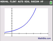
Does the plotted data resemble an exponential curve?
• the curve will either rise or fall.
• the curve will not "turn around" like a parabola.
• "exponential of best fit" |
 It may not always be obvious from looking at the scatter plot which shape (curve) will be the best fit. Some situations may require more investigation before deciding upon a possible shape (curve), and some situations may not be modeled by any of these shapes (curves). It may not always be obvious from looking at the scatter plot which shape (curve) will be the best fit. Some situations may require more investigation before deciding upon a possible shape (curve), and some situations may not be modeled by any of these shapes (curves).
NOTE: Comparing correlation coefficients of different regression models for the same set of data should not be used to determine which is the "best" regression model.

We will be using the graphing calculator to determine the regression equations for our examples.
When using the TI-84+ family of calculators,
go to STAT, arrow right to CALC, and arrow down for regression equation choices. |
| |
|
 |
Linear Regression (LinReg) |
|
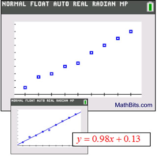
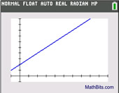
Does this scatter plot shape look familiar?
It appears to be a straight line with a positive slope.
We should use a linear regression.
The calculator shows:
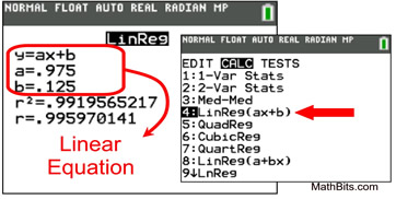 Calculator help with Linear Regressions Calculator help with Linear Regressions |
The linear regression equation can now be used to predict y-values that may lie within the plotted values, from x = 0 to x = 9, or beyond the plotted values. For example, if x = 12, we predict (extrapolate) that y = 0.98(12) + 0.13 = 11.89.
Note: On the TI-84+ family of graphing calculators,
a linear regression can be found using 4:LinReg(ax+b) or 8:LinReg(a+bx).
Read about the difference at
"LinReg(ax + b) versus LinReg(a + bx)".
|
 |
Quadratic Regression (QuadReg) |
|
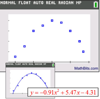
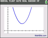
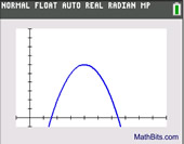
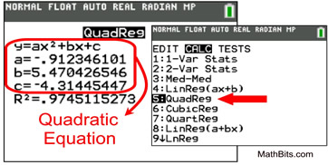
Does this scatter plot shape look familiar?
While not a perfect fit, it closely resembles a parabola opening downward. Parabolas are the graphs of quadratic equations, so this is most likely a quadratic regression. The calculator shows:
 Calculator help with Quadratic Regressions
|
| The quadratic regression equation can now be used to predict y-values that may lie within the plotted values, from x = 0 to x = 5, or beyond the plotted values. For example, if x = 3½, we predict (interpolate) that y = -0.91(3.5)2 + 5.47(3.5) - 4.31 = 3.6875.
|
 |
Exponential Regression (ExpReg) |
|
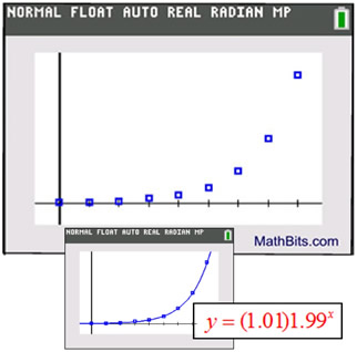
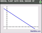
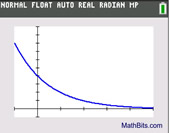
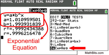
Does this scatter plot shape look familiar?
It could possibly be half of a parabola.
But the "leveling off" nature of the left hand side of the graph implies that this is more likely to be an exponential regression. The calculator shows:
Calculator help with Exponential Regressionsz
|
The exponential regression equation can now be used to predict y-values that may lie within the plotted values, from x = 0 to x = 8, or beyond the plotted values. For example, if x = 10, we predict (extrapolate) that 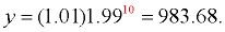
|
Keep in mind that when working with real world data, it is unlikely that any regression model is going to be a "perfect fit" (pass through all of your data points). Your goal is to find the model that fits as many of the the data points as possible and will be the best indicator of trends in the data.

NOTE: The re-posting of materials (in part or whole) from this site to the Internet
is copyright violation
and is not considered "fair use" for educators. Please read the "Terms of Use". |
|